Logo Design
Another Tufts Is Possible
Another Tufts is Possible is “a collective of faculty curating a digital platform, community conversations, and collective vision for a more just institution. We recognize that Tufts University does disproportionate harm to Black people and other racialized members of our community. We see the need to name and analyze this systemic hazard, and then to envision together the remedies and repairs for our future. Taking our lead from the Movement for Black Lives, we believe Another Tufts Is Possible. We invite all members of the Tufts community, across all schools and campuses, to collectively imagine a Tufts for Black Lives. All submissions will be read and highlights will be published on the website and social media platforms in an effort to build a collaborative vision.”
Main Points
obviously, Black lives and Black life matters
intersectionality
transformative justice
institutional accountability and responsibility
digital activism + direct action
dreaming otherwise + tangible shifts, addressing the roots of systemic injustice

Color Palette

Inspiration Board
Design Sketches
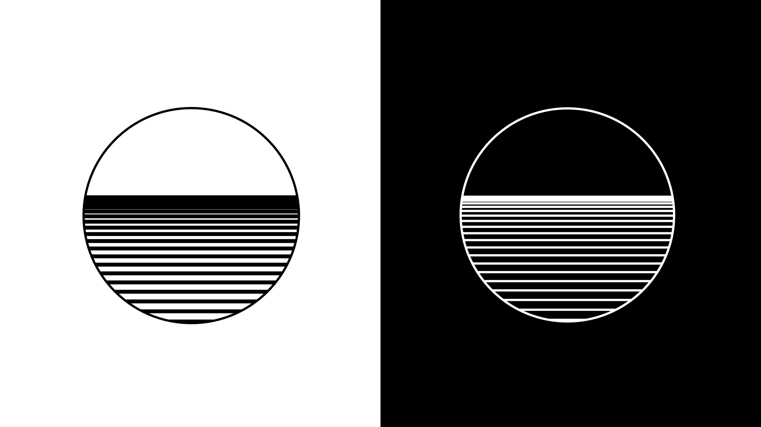
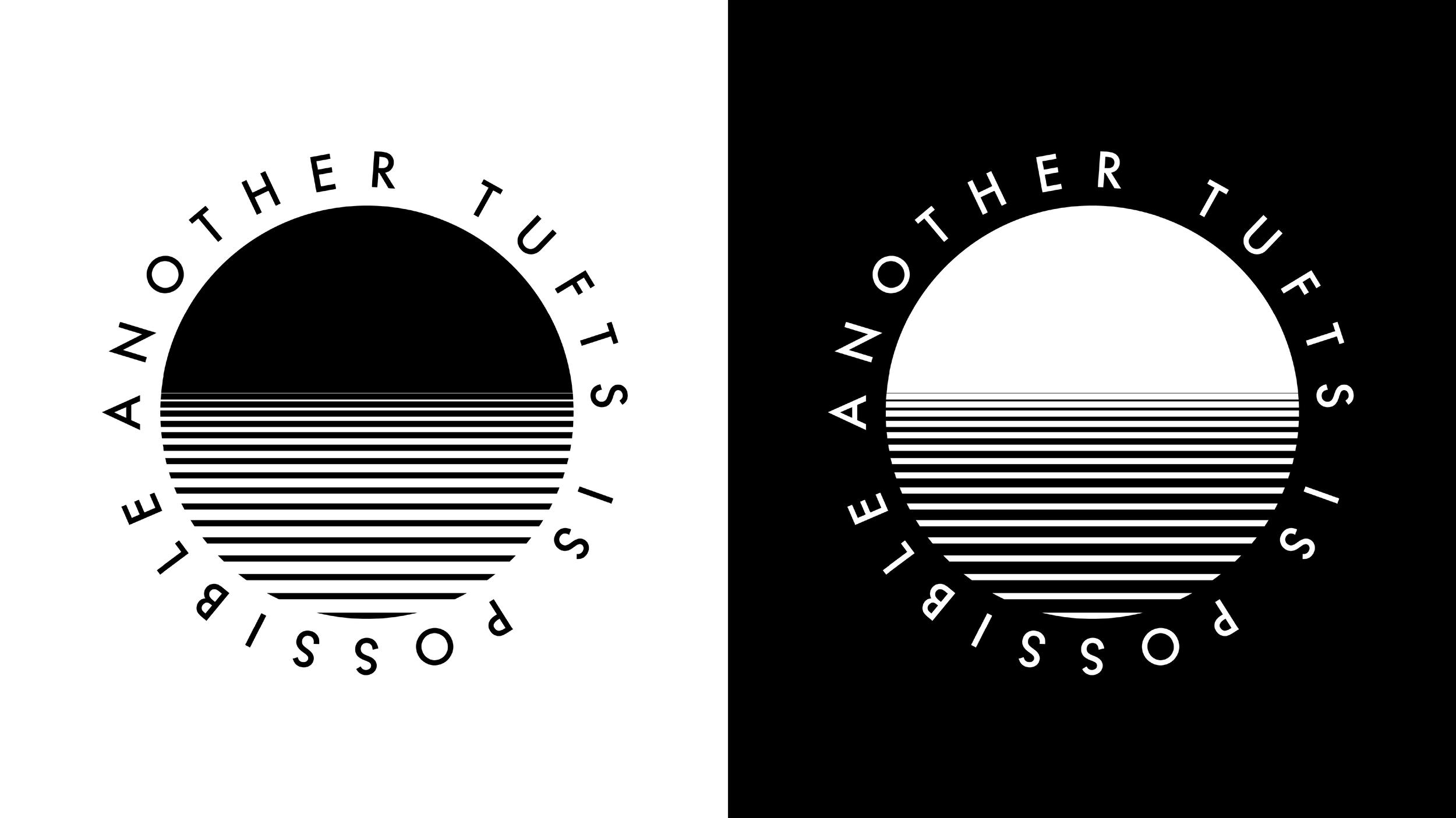
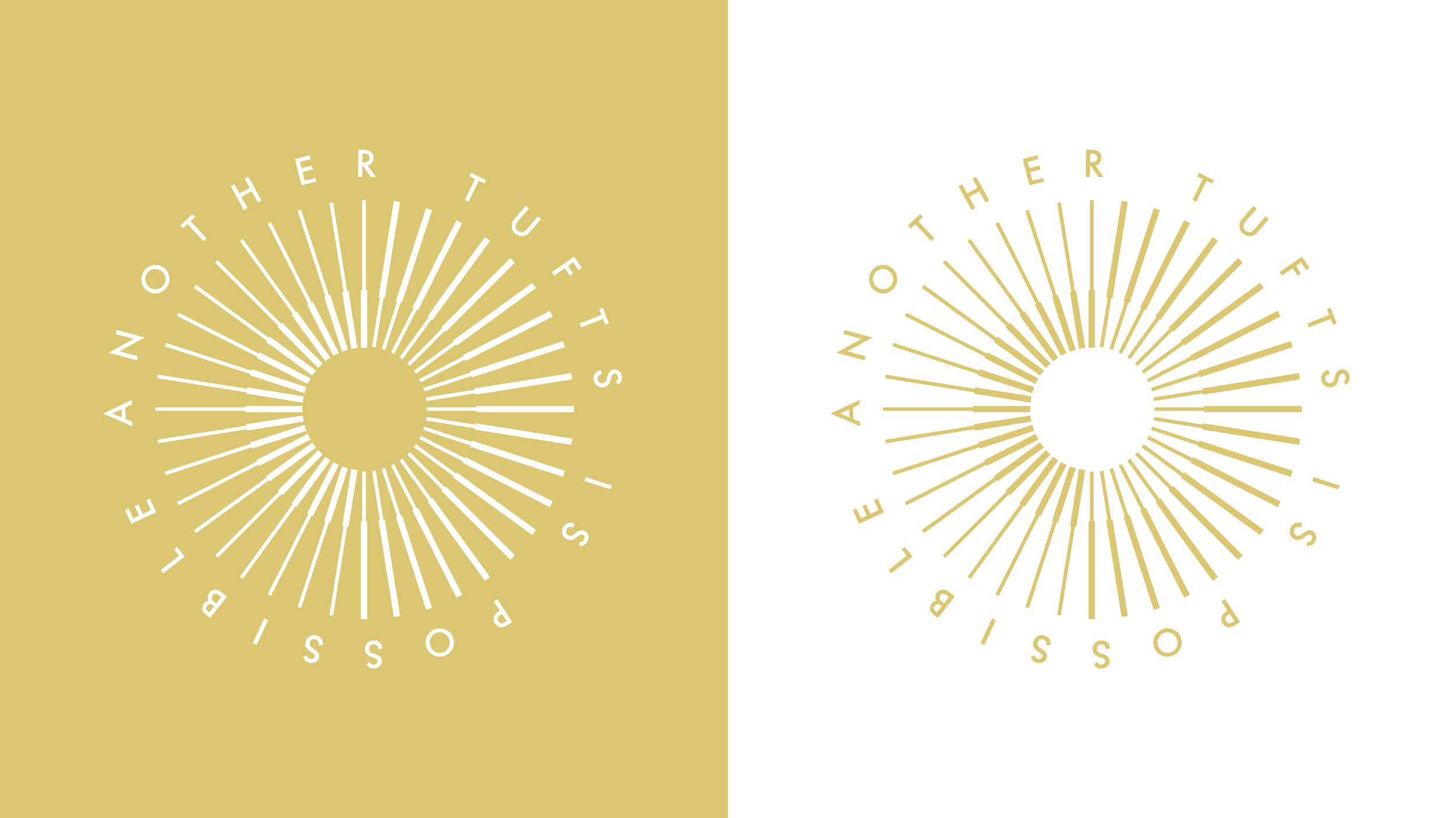
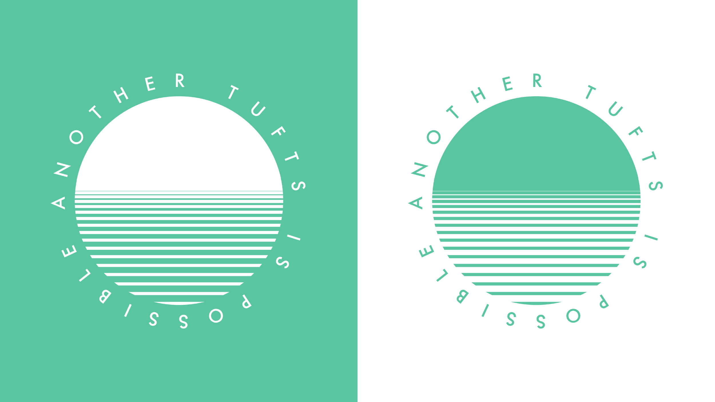
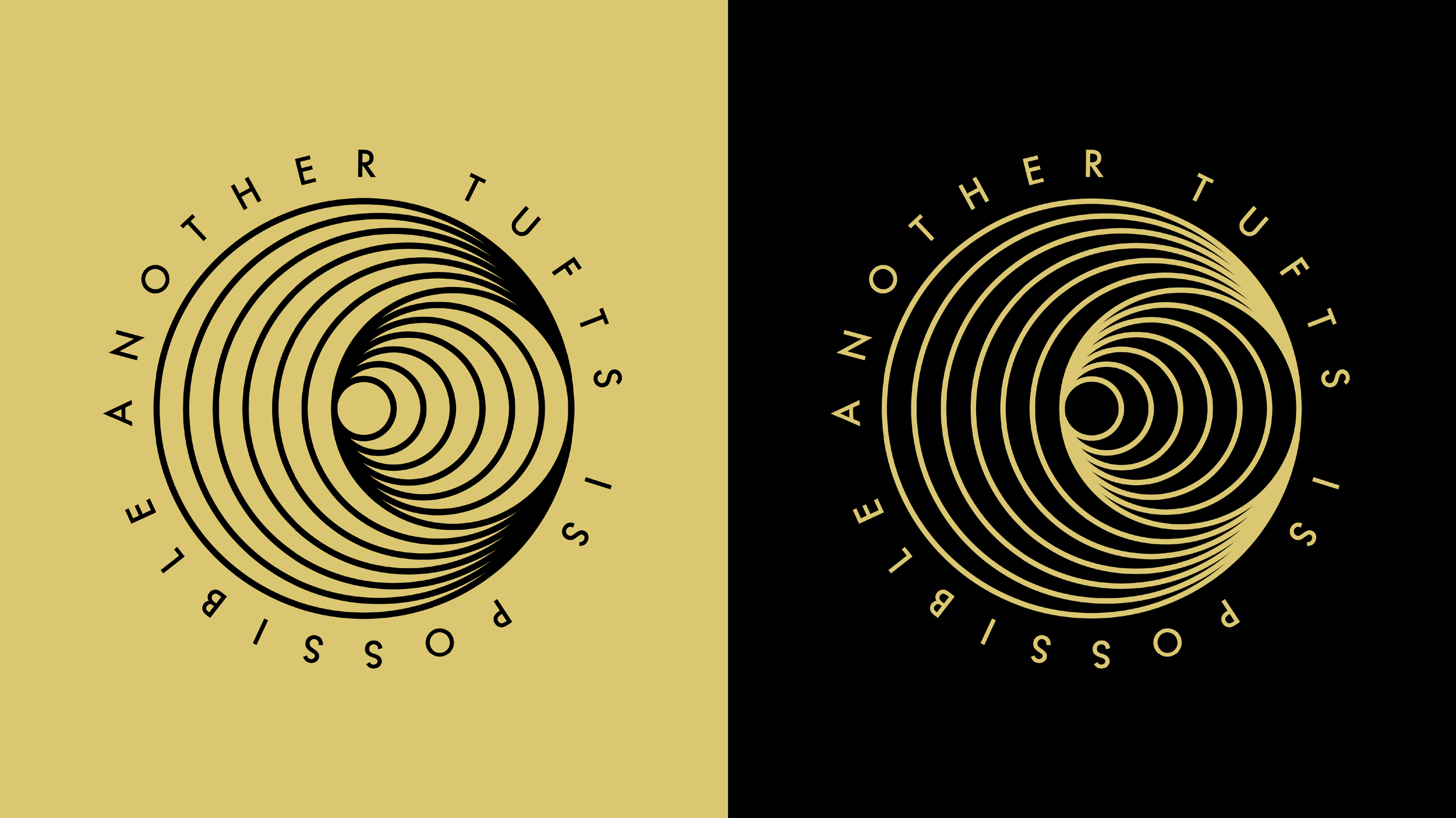
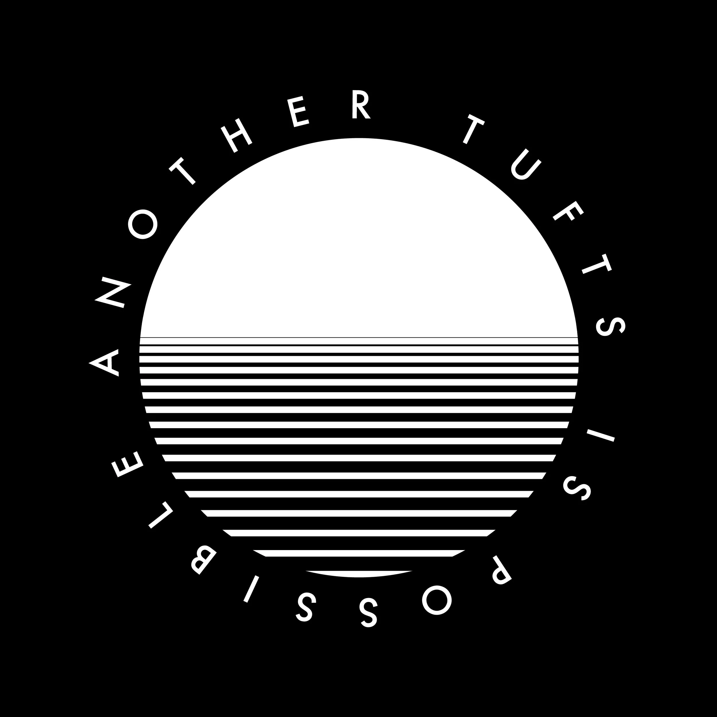
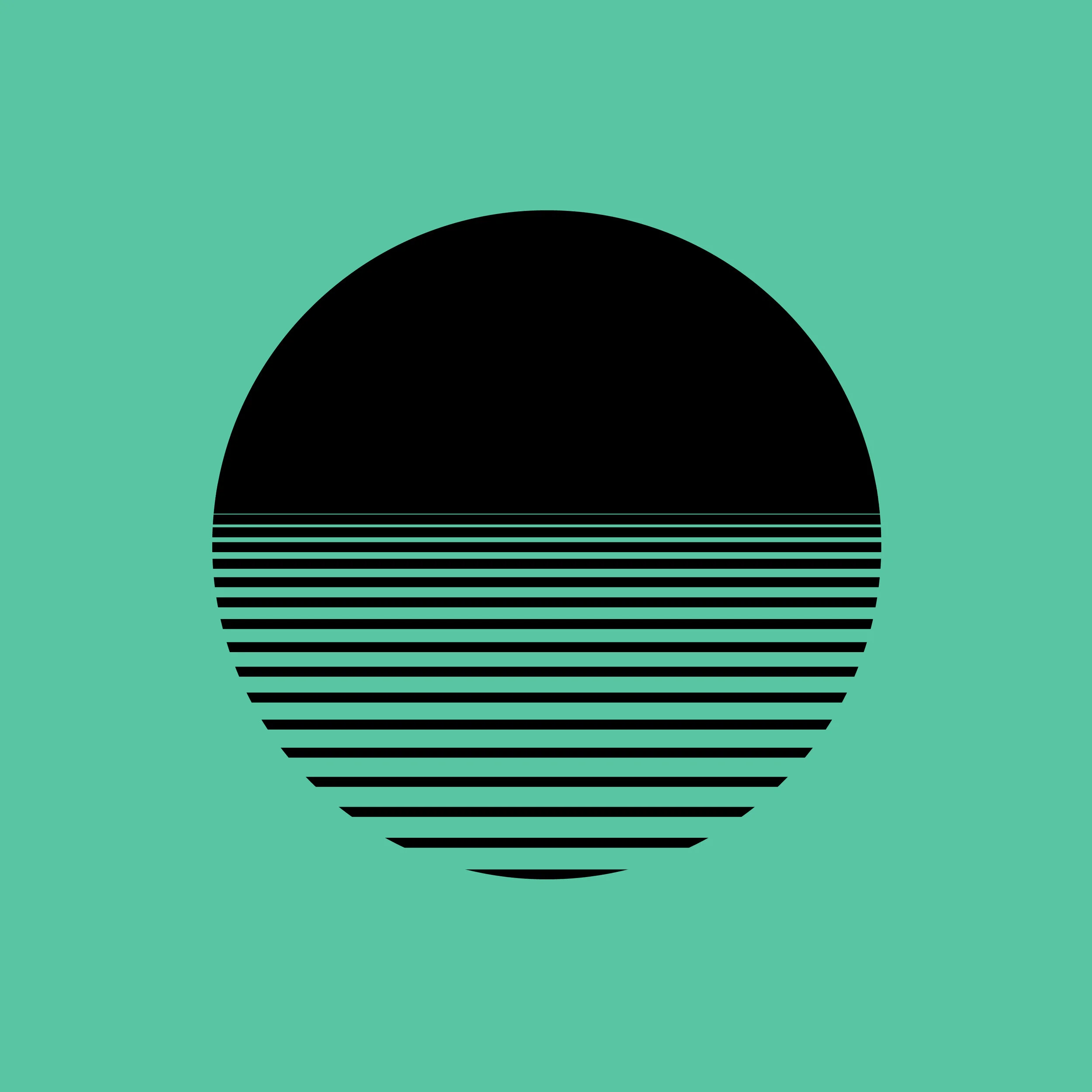
The members of Another Tufts is Possible wanted the logo to be abstract, gesture towards futurity, and world-making. I intended to create a logo that is simple, appropriate, and distinctive. My goal is identification, not communication. The logos draw inspiration from themes of balance, the sunrise, and the Black Power Movement. The curves are imperfect on the elephant and black panther, which is okay because this is a sketch. I kept the concept sketches monochromatic to focus on the form. The geometric shapes are modeled in Rhinoceros, which allows me to ideate quickly and preciously.

Concept Sketch

Concept Sketch

Concept Sketch

Concept Sketch

Concept Sketch

Concept Sketch

Concept Sketch

Concept Sketch

Concept Sketch

Concept Sketch

Concept Sketch

Concept Sketch

Concept Sketch

Concept Sketch


Accessibility
I added closed captions to Another Tufts is Possible Webinar. While editing, I made sure to spell all names and student organizations correctly. Additionally, I suggested ATIP use stream text to caption future webinars, so the live event is accessible.
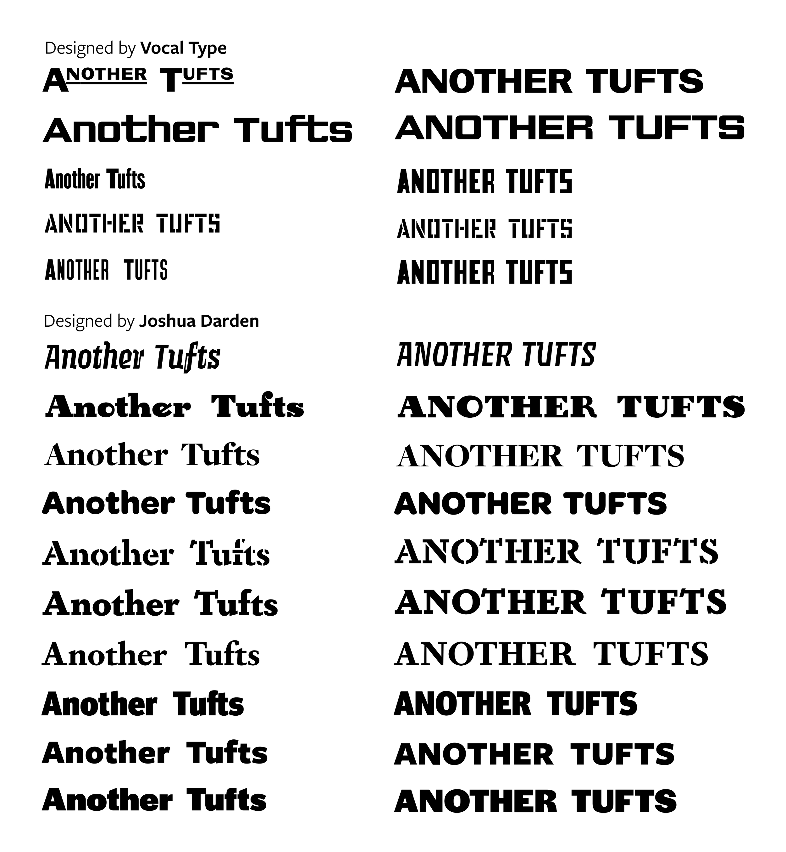
Typefaces
The members of ATIP designed Instagram posts where the logo took up too much space, and the serif typeface was difficult to read. I redesigned the Instagram posts centering accessibility and Black designers. My goal to practice care work. Decentering whiteness means recognizing that white supremacy is woven into design principles, trends, and default options. What does it mean to assume Helvetica is the accessible standard? Design is not neutral.